
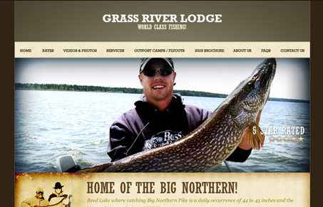
Very nice, complete looking marketing site for this vacation destination. I’m happy the makers of this site pulled it off without making it all flash. Bravo!


Fitts’s Law: Why the Easy Button Wins
Large, close targets are faster to hit than small, distant ones, that’s Fitts’s Law. A look at the 1954 rule behind buttons, prime and magic pixels, thumb zones, and dark patterns.


This site doesn’t look quite finished to me. The rustic/weathered elements look ok on their own, but they’re all cordoned off in their little boxes, there’s no overlap or depth that could really make this site feel finished.
I think it looks pretty ‘finished’ to me. I agree that some overlapping of elements might make it better and pull the sections/boxes of stuff together more though.