
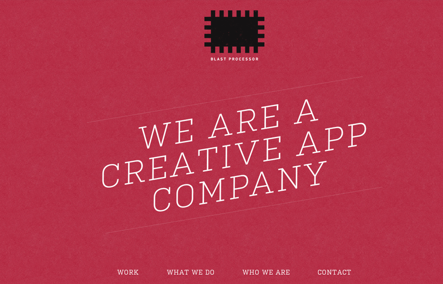
I love the red color and texture used for the main intro section and header for the Blast Processor site. I also like how the header slides into a fixed position and at the same time the main nav slides to the right. Overall a nice clean layout that works well in most of it’s responsive screen width targets.


Chunking: How to Design for a Brain That Can Only Hold Four Things
Your working memory holds about four things, not seven. Chunking groups loose information into meaningful units that slip past that limit, the psychology behind phone numbers, scannable pages, multi-step forms, and grouped navigation.


0 Comments