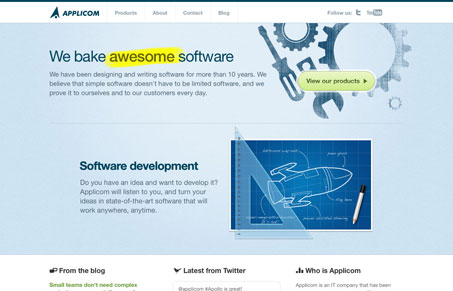
The Applicom site is a great example of a clean corporate looking design that has some flavor at the same time. The illustrations and bold copy make it just different feeling enough. It’s a simple design but has some character. I like that.
The Applicom site is a great example of a clean corporate looking design that has some flavor at the same time. The illustrations and bold copy make it just different feeling enough. It’s a simple design but has some character. I like that.


Glassmorphism brings transparency, depth, and light back into modern UI. Learn how this “frosted glass” design trend enhances hierarchy, focus, and atmosphere, plus how to implement it in CSS responsibly.

Brutalism in web design rejects perfection for authenticity. Stark grids, raw type, and honest structure create interfaces that feel human, intentional, and impossible to ignore. Break the rules, on purpose.

Monochrome Minimalism merges Bauhaus discipline with IKEA simplicity. Clean grids, muted tones, and functional beauty create digital calm, proof that restraint, not decoration, defines timeless design.
I like the design a lot, it’s pretty smooth. I didn’t realize the middle section was a slider. I would like to see some slider controls there… even if it is only 2 slides. It would help draw attention to the interaction and give the user an illusion of control.