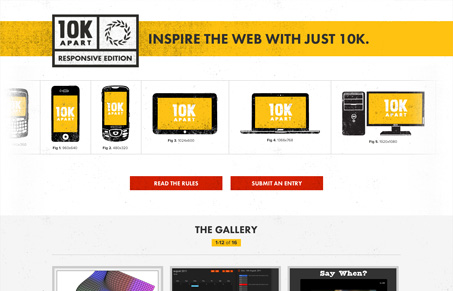
Beautifully simple website. From top to bottom this site has all the components that I enjoy. It has nice illustrations (even down to the submission form, with the browser icons.) It’s Responsive and also has a subtle parallax effect applied to the header and the various device illustrations. I just love stuff like this where you can see the love of craft put into it.
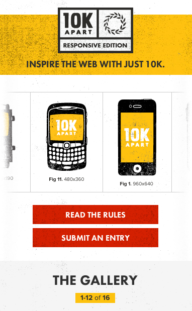


Can’t go wrong with something that is both clean and has personality. Its a great design for showcasing the 10k submissions.
They forgot to specify a page background color, though.