by Gene Crawford | Mar 31, 2014 | Gallery, Portfolio
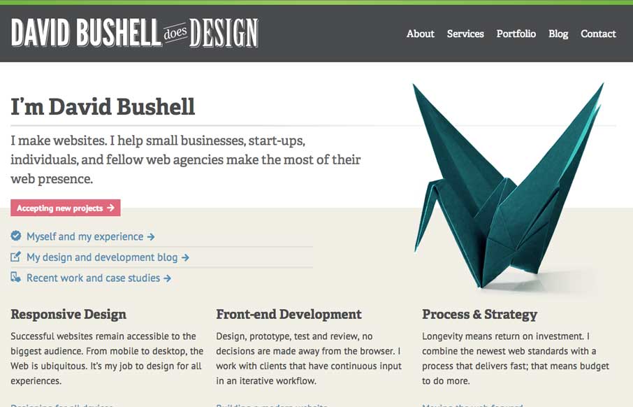
I really dig how this site design has the vibe of a larger agency but it’s really just for a single person. It instills trust that goes beyond a single person shop to me. I like the treatment on the origami swan as you resize the browser too. It all feels very...

by Gene Crawford | Mar 28, 2014 | Education, Gallery
Nice, Harvard has a responsive site design now. Not sure how long it’s been relaunched but I like it. It’s one of the better collegiate designs as far as i’m concerned. I really dig the featured marquee area and how they change for focus based on the...
by Gene Crawford | Mar 28, 2014 | Gallery
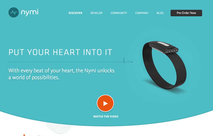
Nice product site design here with nymi. I really like the main featured area and the focus put into designing for different screen widths for it. The little radiating lines animation is a nice subtle touch too.
by Gene Crawford | Mar 27, 2014 | Gallery, Portfolio
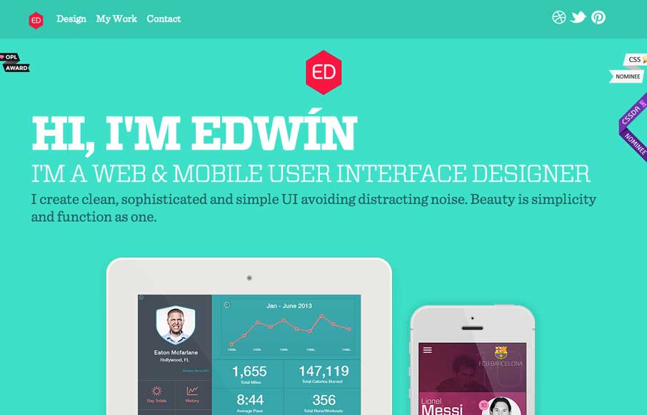
Nice clean look to this portfolio site. I like the about text on this site, typically on portfolio websites it’s largely useless but on Eddie Diaz’s it’s actually informative. Bravo!
by Gene Crawford | Mar 27, 2014 | Gallery
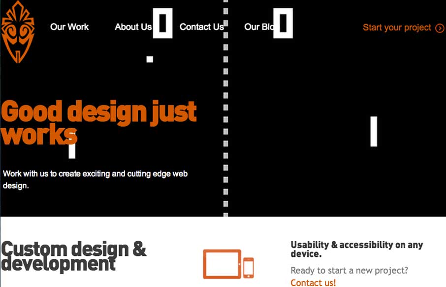
Overall the layout of 3 One Seven is intense visually. There’s blocks of imagery competing for your attention – which as I review this site appears to be the point of the design. It’s successful in that the images are actually compelling visually and...