We are looking for editors. If you think reviewing websites would be fun, or even writing blog posts, please drop us a email and say hello! 🙂

Web Design Inspiration Curated

Wyse Meter

Wyse Meter

Super rich graphical design. Sharp photos and timing on the scrolling. I like it most at the point where it goes from the kinda "hero" section to the more content centric portions on the page. Solid work.

Okgreat

Okgreat

A nice mix between creativity and a clean interface with some funky fonts and sweet animations.

Roud Studio

Roud Studio

Roud Studio’s creative website ingeniously displays usability in a unique and distraction-free way. With a focus on simplicity, it invites users to explore seamlessly, highlighting our innovative features without unnecessary clutter. Welcome to an online space where creativity meets functionality with a touch of unexpected delight.

Halo Lab

Halo Lab

Halo Lab’s product-oriented website features a folder-based style, offering intuitive navigation with a streamlined, organized interface reminiscent of a well-curated portfolio.

GitButler

GitButler

Very strong design for GitBuilder, I love the detail work put into the interactions and such. Very clean layout and just fun. https://youtu.be/-fJsKwL0jwE

Meat

Meat

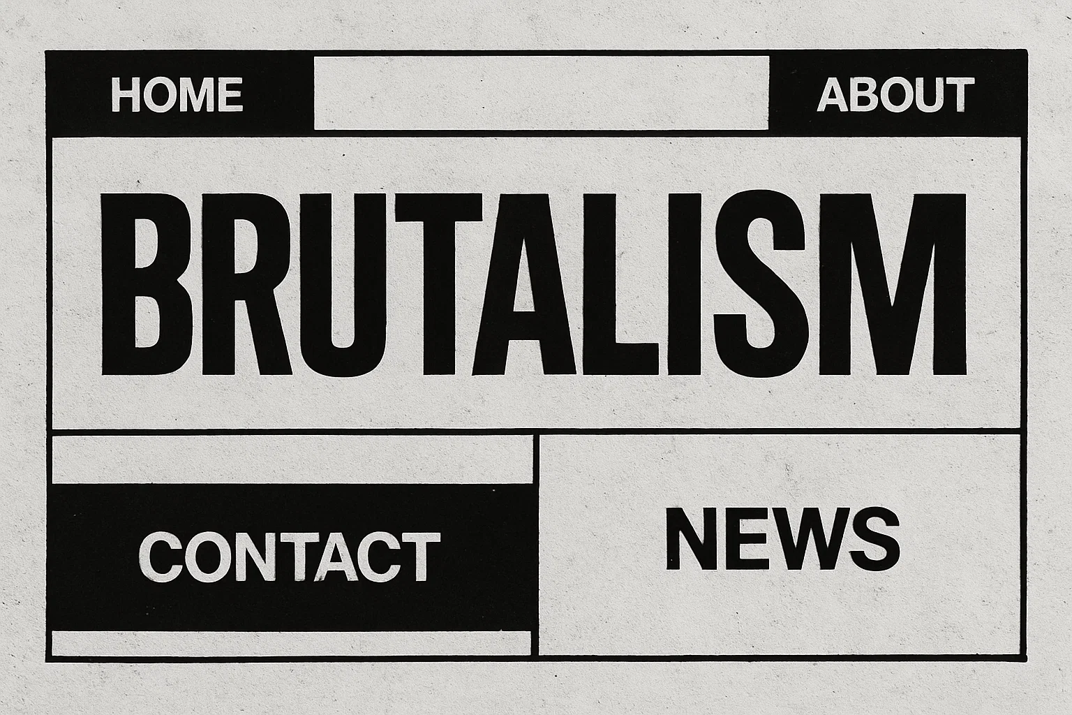
Brutalist style design? I kind of like it, the mouse-overs on the hero section are a mystery to me though. Overall I dig the layout and design. Fun stuff.

Method

Method

The design studio Method offers a visually delectable treat with their Bento box, brimming with sugared almonds. Their adept use of pastel hues and curved corners infuses a modern, upbeat ambiance into the design, creating an inviting and aesthetically pleasing...

Electra

Electra

Electra, a manufacturer of car charging hubs, presents a website that exudes modernity and cleanliness in a subtle yet compelling fashion. The design features rounded corners and seamless, animated interactions, elements that contribute to its understated yet engaging...

bitesized

bitesized

Bitesized has ingeniously crafted a website, cleverly themed around the world of fast food. The concept is brilliantly executed, featuring a striking color palette that resonates with the fast food industry, along with impeccable use of display typefaces that capture...

Robin Mastromarino

Robin Mastromarino

Robin Mastromarino, an interface designer deeply intrigued by user interaction, crafts a site with a playful ambiance. Projects are ingeniously presented on a clickable wheel, and the seamless transition upon clicking a project, where the header image straightens...

Locomotive

Locomotive

Locomotive adopts a minimalist brutalist aesthetic for its portfolio, yet it infuses the design with engaging elements, such as animated interactions and image pixelations, which enhance the visitor's experience.

Steve Wolf Designs

Steve Wolf Designs

Love the grid here. The juxtaposition of the type and images is solid. I like the little "flitter" of the photo before it loads into it's place on the grid, it's subtle, not subtle, and always makes you take note of the element.

Tux Karma

Tux Karma

Tux Karma, an initiative by creative agency Tux, is dedicated to championing projects focused on social and climate justice. The website features a bold design, marked by vibrant, fluid backgrounds, and an array of distinct typefaces. Additionally, it incorporates...

Studio Feixen

Studio Feixen

Studio Feixen's portfolio strikingly exemplifies the art of infusing vibrance without inundating the user. A harmonious equilibrium between playful and sophisticated elements suggests a perfect fusion of personal flair and top-notch craftsmanship.

Six Eastern

Six Eastern

Interesting overall interaction here making this side scroll. I'm not sold on it 100%, but it kinda works here - makes it all stand out. Good too that it's based on a foundation of solid visual design.

Skye High

Skye High

Skye High employs oversized typography, with the motion cleverly confined to the background layer. The design's synergy is evident as the flying pages from the background animation interact with the letters, proving that an engaging visual doesn't require excessive...

Alfred

Alfred

In the hero header, a bold, easily readable text layer smoothly scrolls from right to left. What stands out is the minimal word count, making reading during motion user-friendly. Moreover, this moving text layer is overlaid on an animated video roll, and the...

Grain & Morter

Grain & Morter

Beautiful, simple and clean design always wins. I love all the elements of this design - from the easy going type treatment to the fun illustration work, solid work.

kappow

kappow

Cool, almost minimal layout. I like the interaction when you move your cursor over the K - pretty neat/fun. I like how certain sections load for you as you scroll down the page, it really rewards the user well for exploring the content.

Lovi

Lovi

Pretty nifty one-pager. I really like how the targeted scrolling sections draw you in and then help educate on the app's subject matter. Solid photo and detail work as well - i'd expect that from an AI based app too.

EMAIL NEWSLETTER

News & Articles

The Power of Typographic Hierarchy in Graphic Design

The Power of Typographic Hierarchy in Graphic Design

Unlock the power of typographic hierarchy in graphic design to communicate effectively with viewers. Craft attention-grabbing headlines, use subheadings, emphasize key points, and create a seamless reading experience for improved SEO rankings.

JockoFuel

HARD WORK. CLEAN FUEL. NO EXCUSES

Use “WARRIOR2023″ for 10% off.

Filter Designs