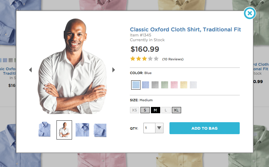
Many of us have encountered ‘Quick View’ functionality in our online shopping experiences. The ‘Quick View’ button allows us to see a bit more information about the product page without leaving our current path. This functionality has a been a common practice on e-commerce sites for quite a while. In fact, approximately half of the sites we’ve surveyed use a ‘Quick View’ function. In this article, we will talk about why ‘Quick View’ is so frequently implemented as well as some better approaches to solving the same customer needs.
In e-commerce, providing the right product information at the right point for customers directly affects the bottom line. A recent study by Baymard Institute found that 48% of US e-commerce sites provide too little information on their product lists. At the same time, too many secondary and repetitive details can overwhelm customers and make it harder to choose which product is worth further consideration. This dilemma requires a balancing act that even some of the largest e-commerce retailers are struggling to solve.
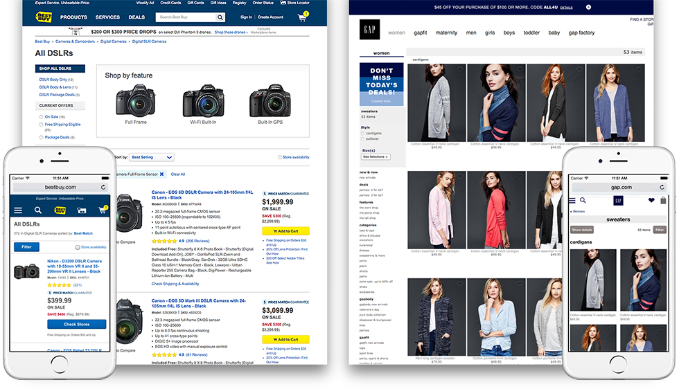
Above: On the left, Best Buy is offering a lot of details on each list view item. The result on mobile is that a single product takes up more than half of the vertical screen space, making it difficult see that users are looking at a list of items. On desktop, so much information is provided that it is difficult to scan the list and compare product specs. On the right, GAP has done a nice job of keeping the size of each item concise and providing nice images. However, customers need to click to find out if each item is available in other colors or patterns.
We recently tackled this challenge at eHouse during the responsive redesign of four sites for a major retailer with thousands of product SKUs. We have tackled this design problem and can certainly relate to the dilemma retailers face.
Using ‘Quick View’ to Solve the Problem
When usability issues appear on the product listing page, ‘Quick View’ is often implemented to address the problem. It appears to be a logical solution for the balancing act – providing additional product information upon user request while keeping the product listing page minimal and reducing the need to dive into product details on the wrong items. However, Baymard Institute’s recent research found that this approach typically tests well on sites that have insufficient information on the list view, and therefore often shows a small conversion increase when implemented. Unfortunately, ‘Quick View’ also comes with some usability issues that need to be considered.
Usability issues with ‘Quick View’
In their recent article, “Product List Usability: Avoid ‘Quick View’ Overlays,” the Baymard Institute describes several usability issues they have uncovered with typical ‘Quick View’ functionality.
- The first issue is that users can sometimes mistake the Quick View for the product page. Since the overlay provides additional product information and an ‘add to cart’ button, users sometimes assume this is all the available information about the product. If it is not sufficient for them to make the purchase, they move on.
- The second, but related, issue is due to positioning. Since many ‘Quick View’ buttons often overlay the product image, users who intend to click on the product image to view the product detail page, often click on the Quick View by mistake. For those users who don’t notice this error, this can further reinforce the first misconception that the Quick View is the product page and that there is no additional product information available.
A Better Approach
The Baymard Institute recently published the article “Product Lists: Display Extra Information on Hover (76% Don’t)”, in which they discuss implementations of hover states that test well with customers. The advantage of a hover state is that they are less likely to be interpreted as pages since the user did not actively click and load an additional layer. Hover states can provide sufficient information for users to determine if a product may suit their needs. Information on hover states can provide secondary information such as ratings, dimensions, available sizes, additional images, available colors, or product variations. Another advantage of this approach is that the product listing page can remain relatively simple, allowing the product images to be easier for users to scan and compare.
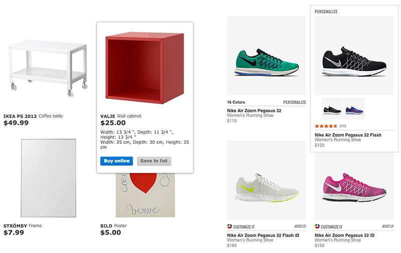
Above: Hover states show additional product information on Ikea (left) and Nike (right).
We at eHouse agree with Baymard’s recommendation that hover states on desktop make a lot of sense. But what about mobile?
Mobile First
While a hover is an excellent solution for desktop, we know that the mobile traffic on many of our client’s e-commerce sites is over 50% and climbing. And on mobile, we don’t have the advantage of a hover state. In addition, the screen size requires a delicate balancing act between keeping each item under half the height of the vertical viewport (so users can see an overview of their options) and keeping the images and hit areas as large as possible for fingers to hit.
At eHouse, we begin our solutions with mobile first and most often create responsive sites that work for all devices. This approach forces us to make the most difficult decisions up front and provide progressive enhancement as increased space allows on desktop. If we can make the right strategic decisions on mobile, there is a good chance that our desktop experience can only improve.
Vital Information for Product List Items
We believe considering what is truly vital information across breakpoints for product list pages is key. Some information is relevant to all product types, such as a high quality thumbnail, a price, an informative product title and availability. Once this critical information is in place, we need to weigh additional content types for their relevance to the kind of product. When shopping for a sweater, knowing that the item is available in multiple colors is helpful. However, when shopping for a camera, ratings or critical specs may be more important. Customers and usability research need to dictate the information that is most helpful for customers to compare the items in the list while leaving the next level of detail for the product page.
Progressive Enhancement
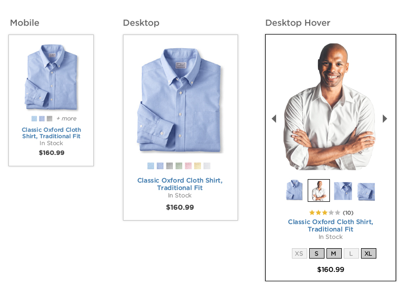
As screen real estate increases, a responsive site has the advantage of enhancing this experience at each breakpoint. For example, on mobile space may only allow us to show colors in small squares, while on desktop, we can offer thumbnails of the product in each color. And for cameras, maybe only one or two specs are available on mobile, but on desktop a few more key specs can be provided on hover.
Here are a few examples where we see the potential for progressive enhancement:
Example 1: Men’s Shirts
Example 2: DSLR Cameras
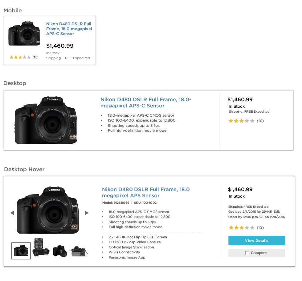
Above: For items that require more spec comparison, such as cameras, a list view provides more space for critical information. Detailed product titles allow more information to be displayed on mobile. Ratings also become vital for these types of products. On desktop we can provide information such as more specs and the option to compare products. And finally, on hover, we can enhance the experience with additional images, more detailed shipping information, and more specs.
Why focus on the product listing page?
Product listing pages are an essential tool for customers to find the product they want to purchase from your store. Getting it right can significantly improve product findability and, in turn, dramatically improve ROI. That said, each store has a unique set of challenges, based on the products, customers, and store business model. At eHouse, our approach is to begin by making the most strategic decisions on mobile, listen carefully to what is most important to your customers when shopping on your site, and progressively enhance the experience for larger devices.
This article was originally published on the eHouse Studio’s blog.


0 Comments
Trackbacks/Pingbacks