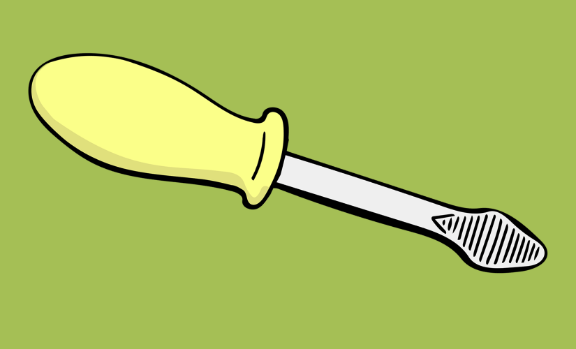
The screwdriver is a really great tool.
Sure, it works for the thing it needs to do (drive screws), but more to the point, the UX design thinking behind this thing is fantastic.
Why is the screwdriver so great?
- The handle is designed to fit into a human palm, giving the wrist plenty of dexterity.
- It’s straight and easy to aim at the screw.
- The whole thing is balanced with a hefty grip and a light point so it doesn’t feel heavy in your hand.
- If you’re lucky, the point is even magnetized to keep a better hold on the screw.
The best part? You don’t think about any of this as you’re using it. A great tool lets the user think about their task, not the thing they’re using to get it done. And no one has to think about how to use a screwdriver. That’s good user experience.
“A great tool lets the user think about their task, not the thing they’re using to get it done.”
But what would the world (and screwdrivers) be like without thoughtful user experience? Without intentional user-driven design? Let’s do an experiment where we completely ignore UX while creating our own screwdriver and see what results we get.
This REALLY doesn’t come to us naturally, but we’ll do it for science.
Method
Using our assumptions and imagination, but without any help from our user experience expertise, we’ll make a new kind of screwdriver. It must work, meaning it has to drive screws. That’s the only requirement.
Prediction & Hypothesis
This is going to go poorly. But! Our screwdriver will technically work. Even@ExperienceDean will be able to build Ikea furniture with it. Possibly.
Redesigning the Screwdriver
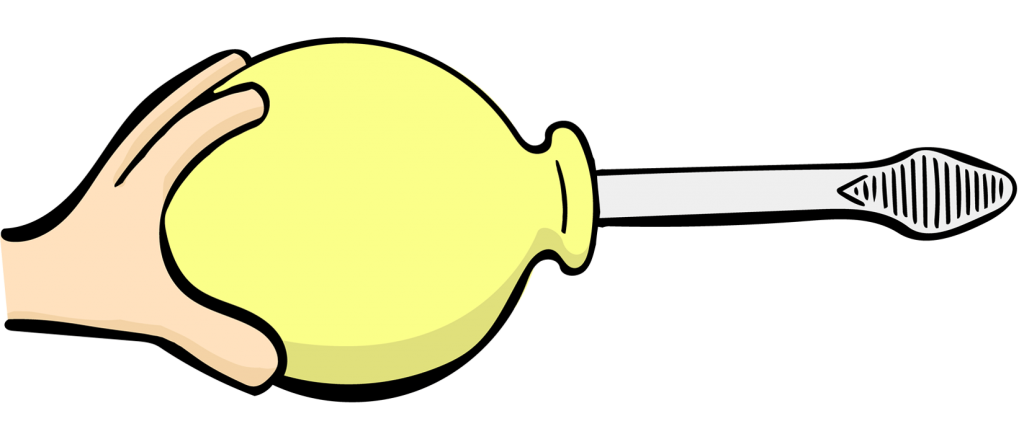
STEP 1: Re-Imagine The Handle
Okay, the handle. We should give this thing some surface area. Let’s make it nice and round.

We lost some torque here, but look how fancy! Torque is a small price to pay. Plus, the screwdriver still technically works. Moving on.
————————————————————————
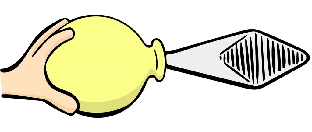
STEP 2: Embolden The Point
This is the workhorse end of the screwdriver. We assume it would need heft to get the job done. Let’s make it big and heavy.

That’s more like it. It will screw a screw, we just need to strengthen our arm muscles and ignore the fact that we can’t actually see the screw. Bonus: We can now also use our screwdriver as a medieval torture device.
————————————————————————
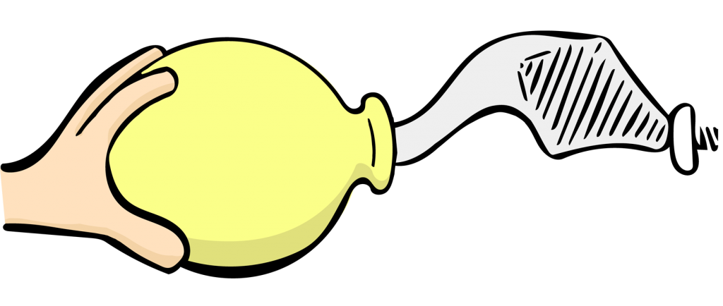
STEP 3: Reinvent The Shaft
You know, there’s probably a really good cutting-edge flexible alloy we could use. Who wants the boredom of a predictably straight, humdrum design? Usability be damned! This is experimentation at its finest.

Tada! We’ve done it. We’ve created a tool that fulfills the requirements and technically works—it drives screws. But it’s obvious to anyone that it’s a monumentally terrible screwdriver. That’s because it ignores the person who must actually use it to get tasks done. We just focused on basic requirements and put our assumptions into action. You can see how that turned out.
So what’s the point?
Functionality is NOT enough.
It’s clearly not enough that something works. Making a thing function is only one part of the process. To make it usable for real people, we have to think about them. We can’t leave out user experience.
But, you might ask, can’t we just add some user experience magic to this inefficient tool now and fix it? Let’s find out.
How will real people use our screwdriver?
- The bulbous handle will be difficult for them to hold.
- Their wrist mobility will be limited because human wrists turn a certain way. A way this screwdriver doesn’t allow for at all.
- The screwdriver will feel heavy because it doesn’t conform to the human hand. Our real users won’t be able to hold it for long.
- The balance will be off because of the heavy, large point.
- The floppiness of whole thing will make it difficult for real people to aim at the screw.
- People using this screwdriver are going to give up and go drink the vodka-orange juice kind of screwdriver instead.
UX can’t fix the unfixable.
These are big issues. So no, the answer is we can’t fix the screwdriver now. You can’t address large problems by “adding” user experience or graphic design to a tool once it is already built. UX pixie dust can’t magically give a flawed screwdriver balance and make it feel lightweight and precise. We also can’t fix it by covering it with glitter and making it pretty. Looking at this ghastly screwdriver, we’d have to start over from the beginning to make it a usable and efficient tool. Even small improvements (a workable handle, for instance) would require collaboration of user experience design and engineering professionals.
“You can’t address large problems by “adding” user experience or graphic design to a tool once it is already built.”
The digital world is no different.
If your tool is a website or mobile app, the same rules apply. Ignoring UX will lead to a tool people may hate using, even if it technically works. Making UX a core part of your digital product (from the beginning) will give you a solid tool that people can use without thinking, the digital equivalent of the perfect screwdriver.
Experiment over. Hypothesis proven: The world (and your software) may technically work without integrated user experience. But a world without UX would be a dark, scary, frustrating place where we would all have to drink a lot more vodka.

This post is syndicated and was originally published on the trumatter blog here.
Author: @baileysendsword
Illustrations: @krisblack.
Concept: Cian O’Conner


User experience is really important in tool design, website design or other designs. The products would not attract customer’s attention when they have bad user experience.
So true, Herbalextract ! You’re right, man!