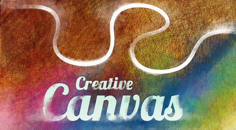
As a designer I’m constantly looking at my work and thinking I can do better. I think that’s common among designers.
With this in mind, I decided to create something different for my portfolio site. As a freelance web designer, people are constantly looking at my work and judging whether I’m up to the task. I know I have to show them something special, so that they can see my quality. A portfolio site is a great opportunity to go all out and do something really different. It’s a tough market out there, so creating something different is worth spending the extra time on.
Visit ianjamescox.com
New Technologies
I came across a jQuery plugin called ScrollPath by joel Besada that really caught my imagination. It set me off thinking how I could create something different with it…
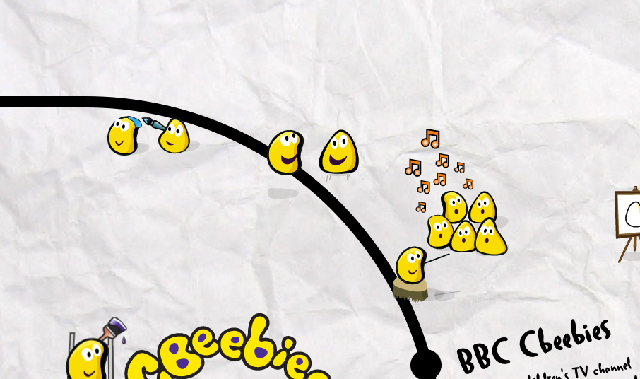
ScrollPath is interesting, as it allows you to draw a custom path using a Canvas-flavoured syntax. JavaScript is used to define the co-ordinates and properties of the paths/arcs and these are in turn rendered to the Canvas element.
The Concept
Illustrations are a big influence in my work. In a recent article, Gene Crawford talks about creating soul. Illustrations do that for me. They instantly give character to a project, using art to bring personality that’s tough to replicate.
Alongside the possibilities of the plugin, I had the idea of creating a large sketchbook full of sketches that you could explore, following a path with unlimited twists, turns, bends and even rotations.
Specialities
I showed the concept to the talented Abid Din, who I’ve worked with in the past. He got as excited as I did when I explained the concept and the plugin. Passing off half the workload sounded great, too. With him involved, I could concentrate on getting the visuals spot on. Skill Swapping only leads to positive results.
Abid, Talking about the Technical
I was really excited when Ian approached me about this project. I’ve worked with Ian in the past, so I’m used to working with his creative concepts.
Before starting the project, I had only briefly touched on the Canvas API. This was a great opportunity to delve further into the API and really see what was possible.
The Canvas API itself isn’t too difficult to work with, but ScrollPath eases the process by simplifying the code needed to render a path to the Canvas. Co-ordinates are used to plot the start and end points of paths. Arcs are created by specifying the start/end angles, radius and direction. Once the paths/arcs are defined, the plugin can be initialised on an element in the document.
The main difficulty we faced during the build was trying to overcome various browser-based inconstancies and issues surrounding the Canvas element.
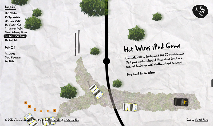
One benefit ScrollPath offers is the ability to view a visual representation of the path in order to aid in development whilst utilising the plugin. We decided to not only use the path as a visual aid, but also as part of the design. As Ian’s site is based around a set of illustrations, the path plays a big part in the design really helps to guide the user along a journey. Instead, of just scrolling up and down the scroll path can follow any arbitrary line. The path below is the one used on Ian’s site.
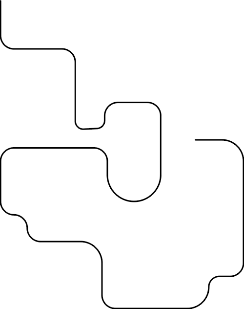
This wasn’t without its problems however. The Canvas element is still relatively new and as such, isn’t perfect across browsers. Surprisingly, Chrome appeared to struggle when rendering a large Canvas element. This forced us to reconsider usage of the path as part of the design.
Later, this was found to be a bug in V18 of Chrome. We decided to use a PNG fallback for Chrome, as well as older versions of IE. Some browsers still struggle with large Canvas elements, which may impact performance for some people.
We concluded that this would probably be the best short-term solution until newer versions of Chrome were able to hopefully fix the bug.
Note: The bug appears to be fixed as of V21 of Chrome (the current version as of writing).
Towards the end of the project, we brainstormed ways the site could be further enhanced. We decided on animating some of the sections with CSS3 in order to further bring the project to life.
[js]
path.moveTo(0, 500, {
name: "home"
}).lineTo(0, 1800)
.arc(500, 1800, 500, 1 * Math.PI, 0.5 * Math.PI, true)
.lineTo(2300, 2300)
.arc(2300, 2800, 500, 1.5 * Math.PI, 0, false, {
callback: function () {
highlight($("#cbeebies-link"));
$("section").find(".animated").removeClass("animated");
$("#bug1, #bug2, #ladder").addClass("animated");
},
name: "cbeebies"
});
[/js]
ScrollPath allows the use of a callback upon navigating to a section. We made use of this callback in order to trigger a CSS3 animation on entering a section and disabling previous animation upon leaving a section. This helped the site run relatively smoothly.
Launch
At first it looks like another generic vertical scrolling site. But when the scrolling begins you (hopefully) experience the wow factor I was after.
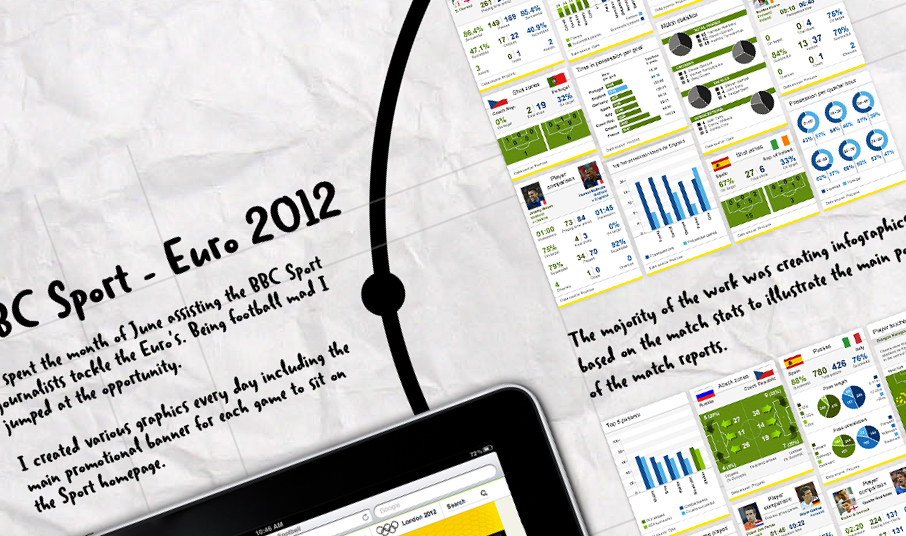
When experimenting with new technologies I find you have to sacrifice some things. In this case, the sacrifices were accessibility, load times, and scalability for other devices such as Mobile, Ipad etc. Not that you can’t do alternate versions, of course.
Luckily for me, I’m the client. That gives me a little more room to push the boat out a bit further. An alternative layout for Mobile is the next thing on my to-list.
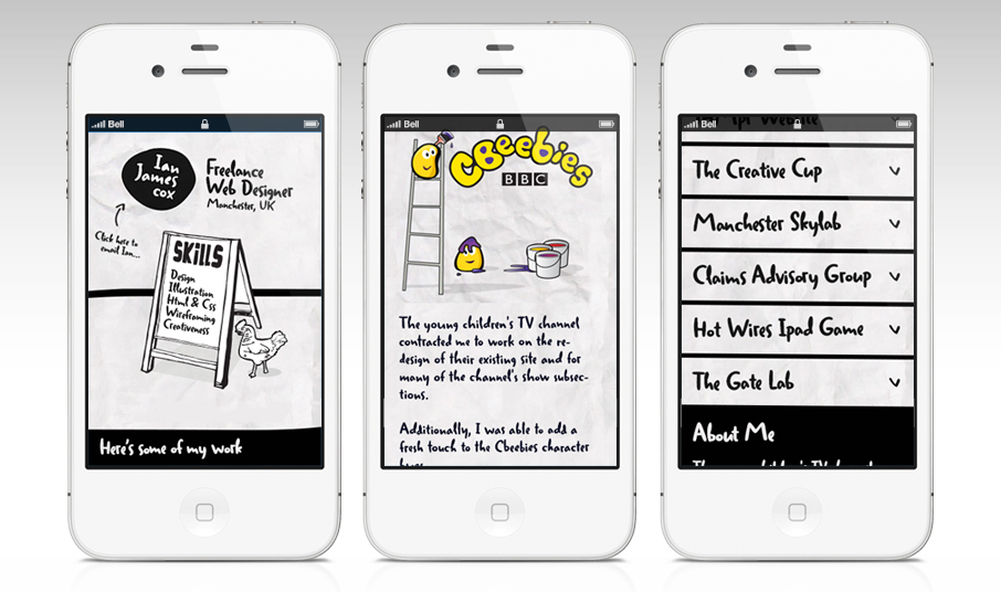
With a portfolio site you can do something a little more adventurous than you would do for a client. Experiment and explore and have fun doing it. Hopefully you’ll enjoy the site and maybe you’ll have an idea to use a similar plugin in a creative way.



Nice article there, Ian. Good insight into processes too.
Great Artical Ian, good insight into canvas creativity.
I love those creative ideas, those are very good. I like it.
Your website is pure awesomeness! Thanks for the article. When I saw your site I thought “How in the heck is he doing that?”!