
In the world of design and user experience, one concept that holds tremendous significance is “Affordance.” Coined by Dr. Donald Norman in his acclaimed book, “The Design of Everyday Things,” this term is a cornerstone for designers in various fields. Affordance refers to the actions a person can perform on an object based on its visual cues and characteristics. However, in the realm of screen design, what truly matters is “Perceived Affordance” – the user’s perception of potential interactions with the elements we create.
According to Norman (1988) an affordance is the design aspect of an object which suggest how the object should be used; a visual clue to its function and use. Norman writes:
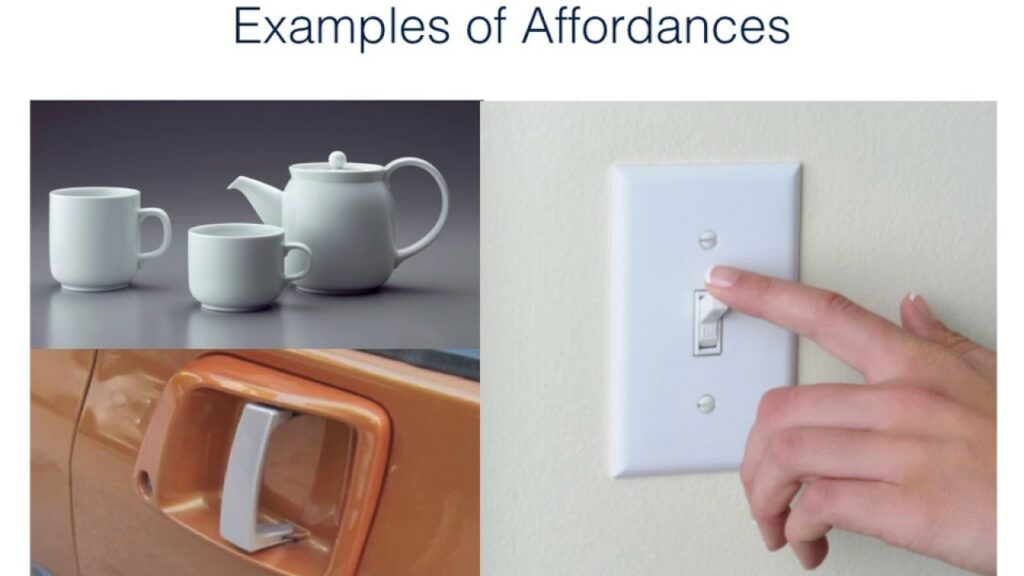
“…the term affordance refers to the perceived and actual properties of the thing, primarily those fundamental properties that determine just how the thing could possibly be used. […] Affordances provide strong clues to the operations of things. Plates are for pushing. Knobs are for turning. Slots are for inserting things into. Balls are for throwing or bouncing. When affordances are taken advantage of, the user knows what to do just by looking: no picture, label, or instruction needed.”
(Norman 1988, p.9)

The Essence of Perceived Affordance
When delving into the digital landscape, the primary objective is to ensure that users readily understand the intended functionality of interactive elements. Let’s take the example of a button on a website or app. It is the responsibility of designers to provide clear visual cues that communicate its clickability. How we present these elements significantly influences how users interact with them, making perceived affordance a pivotal aspect of design.
The Evolution of Affordance in Design
The concept of affordance originally stemmed from the field of ecological psychology. J.J. Gibson, a prominent psychologist, introduced the idea in the late 1970s as the relationship between an organism and its environment. Dr. Donald Norman later expanded on this notion, bringing it into the world of design.
In the physical world, affordance is straightforward. Objects with handles suggest that they can be grasped and pulled, while flat surfaces indicate possibilities for placing things. However, in the digital realm, replicating these tangible cues is not always possible. Designers must rely on visual and interactive elements to convey affordance effectively.
Visual Cues and Their Impact on User Perception
Visual cues play a crucial role in shaping the user’s perception of affordance. Elements like buttons, icons, and links should be designed in a way that aligns with users’ expectations. For instance, a 3D button with a shadow effect conveys clickability better than a flat and static element.
Color also plays a significant role in perceived affordance. Contrasting colors for interactive elements can make them stand out and attract users’ attention. It is essential to strike a balance between a visually appealing design and clear cues for functionality.
Consistency Breeds Familiarity
In the digital realm, consistency is key to enhancing user experience and perceived affordance. When users encounter familiar design patterns across different applications and websites, they can quickly grasp the functionality of various elements.
Consistency extends beyond visual cues to include interactions as well. For instance, users expect the hamburger menu icon to reveal a navigation menu. Deviating from such established patterns can confuse users and hinder their overall experience.
The Role of Feedback in Affordance
Feedback is an integral part of perceived affordance. When users interact with elements, they expect some form of response to validate their actions. This could be visual feedback, such as a change in color or animation, or haptic feedback in touch-based interfaces.
Providing appropriate feedback reinforces the perceived affordance of elements. For example, when a user hovers the cursor over a button, a subtle change in color can signal its interactiveness.
The Challenge of Cultural Differences
Designers must also consider cultural differences when working on international projects. What may be perceived as an affordance in one culture may not hold the same meaning in another. Colors, symbols, and even the arrangement of elements can convey different messages and interactions across diverse cultural backgrounds.
To address this challenge, designers should conduct thorough research and usability testing with representatives from the target audience’s cultural background.
Balancing Aesthetics and Functionality
While perceived affordance is crucial for effective user interaction, it should not compromise the overall aesthetics of the design. A visually pleasing interface with intuitive affordance can significantly enhance the user experience.
Designers must strike a balance between aesthetics and functionality. Too much focus on affordance may lead to a cluttered and overwhelming interface, while too much emphasis on aesthetics might sacrifice usability.
The Ever-Changing Landscape of Perceived Affordance
Perceived affordance is not a static concept. It evolves alongside technological advancements and user behavior. As new interaction patterns and design trends emerge, designers must adapt their approach to ensure the best user experience.
Continuously monitoring user feedback, conducting usability tests, and staying updated with industry trends are crucial steps in keeping up with the ever-changing landscape of perceived affordance.
The Role of Perceived Affordance in Design Patterns and Usability Testing
As design professionals, understanding and leveraging perceived affordance are critical components of our work. When we study design patterns and conduct usability testing for our clients’ products, we delve deep into the realm of how users perceive and interact with our designs.
By optimizing perceived affordance, we enhance user experiences and reduce friction, leading to improved customer satisfaction and engagement. It allows us to create products and interfaces that resonate with users, driving higher conversion rates and overall success for our clients.
Further learning on this subject
Affordances on IXA Design
https://www.interaction-design.org/literature/book/the-glossary-of-human-computer-interaction/affordances
UX Design Glossary: How to Use Affordances in User Interfaces
https://uxplanet.org/ux-design-glossary-how-to-use-affordances-in-user-interfaces-393c8e9686e4
Don Norman’s seven important questions of user interaction
https://uxdesign.cc/ux-psychology-principles-seven-fundamental-design-principles-39c420a05f84
Affordances 101 – What You Can Learn About User Interactions
https://www.uxpin.com/studio/blog/affordances-user-interaction/
What Is The Most Underrated Word In Web Design?
https://www.smashingmagazine.com/2014/06/affordance-most-underrated-word-in-web-design/
Affordance on Wikipedia
https://en.wikipedia.org/wiki/Affordance


0 Comments