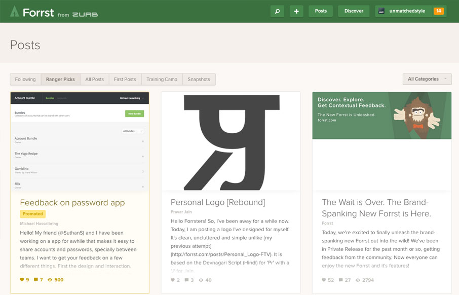
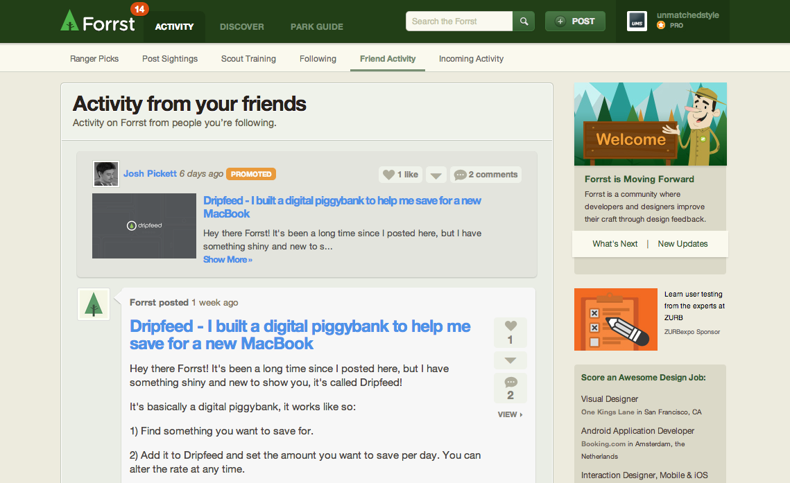
New Forrst
Old Forrst
I asked Chris Brownlee from Zurb for some background on the recent Forrst rebuild and man did he deliver (thanks for such a great update Chris!):
This year Zurb acquired Forrst and we were excited to roll up our sleeves and get to work on a new makeover. We saw an opportunity to build upon what founder Kyle Bragger had created. This unique place is still the top spot for designers to share their work and learn from each other. Our goal with Forrst: to foster a place where designers can get clear, actionable and contextual design feedback, with new tools like annotations and a mobile platform that allows Forrsters to work anywhere.
With this rebuild, we went with our new responsive framework, Foundation. We knew when we started this project Foundation was going to be at the forefront of the refit. We wanted to ensure that designers continued to give and receive feedback anywhere they were. And at the time we had just finished making our Foundation framework mobile first – we were excited to test it out with Forrst.
We also added annotation boxes from our Notable app technology. We needed to consider what was the best way for Forrsters to give feedback from a mobile device. Now users can quickly and conveniently add their feedback precisely in the spot where they are looking to add their thoughts about an image.
What is Forrst
- a unique place where those folks could share their work, learning from one another, no matter what stage they were in their design or development education.
- a place where designers can get clear, actionable design feedback.
- Forrst is a community where developers and designers improve their craft through design feedback.
- A place to increase your design ability through actionable feedback given and received from peers
- A design community within ZURB Expo, our educational platform, where innovative ideas are shared
- Designers can present and critique their work, and critique others work
- Developers can share code and get help on code
- Where designers and developers improve their craft based on feedback
How revamped Forrst
- Creating a mobile web component so Forrsters could comment from their smartphones or tablets
- Improving the visual design to allow for better consumption of posts
- Adding the ability to annotate assets so that Forrsters could leave contextual feedback
- Our goal for Forrst : a stronger, more active design and development Community
- Mobile First redesign (Foundation)
- Annotations for you to give contextual feedback (Notable technology)
- New layout, new visual design, makes it easy to consume posts (Feedback and Users)
Why Notable technology
- We wanted to give Forrsters a quick way to give detailed design feedback on interface screens
- We wanted Forrsters to have the ability to comment on screenshots, sketches or wireframes from any device.
- When not on a mobile device they can upload them and annotate them from a desktop browser.
- Now Forrsters can take any screenshot, sketch or wireframe across devices and exchange notes on specific details in the community.
- We wanted to provide quick replies so the community could get feedback accurate and fast…
The benefit for designers
- This is a tool to become a better product designer.
- What’s cool is that its a place where feedback is mostly centered around design and coding problems.
- Easily promote your work and gain awareness through Forrst
- Designers can receive quality feedback from people in their space
- Complete responsive build out so designers can upload ideas on the go
- You learn more skills as a designer or a developer
- Consistency in visual design critiques
- Ranger picks highlight the best work, Ranger Snapshots bring the best designers into the community
We are excited to present the New Forrst and we look forward to what the future holds for the mobile designer, artist, developer and those who just love to learn how to improve their design technique. Forrst launches October 2013.


0 Comments