
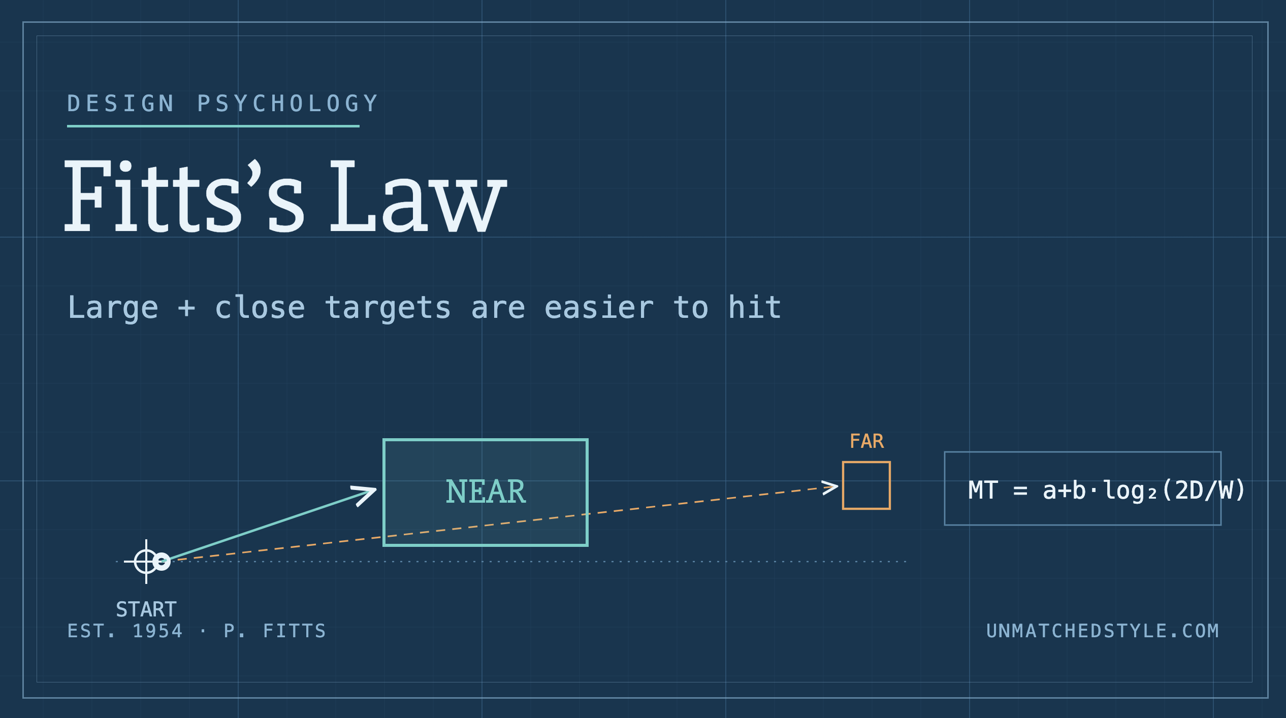
Every interface is a series of small races. A person decides to do something, buy, submit, cancel, skip, and then their hand has to physically travel to the thing that does it. We spend enormous energy on what a button says and how it looks, and comparatively little on the part that actually determines whether it gets clicked: how hard it is to reach. Fitts’s Law is the rule that governs that race, and once you see it, you can’t unsee it in any product you use.
A law that came from cockpits, not websites
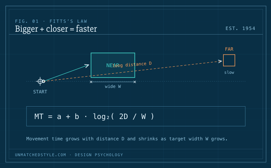
The idea predates the web by four decades. In 1954, the psychologist Paul Fitts was studying the human motor system, the kind of work that mattered for designing aircraft cockpit controls, where reaching for the wrong switch had consequences worse than a bounced form. Fitts showed something that sounds obvious until you try to argue with it: the time it takes to move to a target depends on the distance to that target and, inversely, on its size. Bigger and closer is faster. Smaller and farther is slower, and it comes with more errors, because fast movements toward small targets produce a speed-accuracy trade-off, you either slow down to land precisely, or you overshoot.
That’s the whole thing. It’s one of the most reliably reproducible findings in human-computer interaction, and it applies whether the “pointer” is a mouse cursor, a fingertip on glass, or a hand reaching for a physical dial.
The math, briefly (you can skip it)
Fitts expressed his finding as a formula, usually written as MT = a + b · log₂(2D / W), where MT is movement time, D is the distance to the target, W is its width, and a and b are constants that depend on the input device and the person. You never need to solve this to use it. The part worth internalizing is the shape of the relationship: movement time grows with distance and shrinks as targets get wider, and the logarithm means the payoff from enlarging a target is steep at first and then flattens. Doubling a tiny target helps a lot. Doubling an already-large one barely matters.
The practical translation is a concept UX people call interaction cost, the sum of effort a person spends to accomplish a goal. Small, distant, precision-demanding targets raise that cost. Every pixel you add to an important target and every inch you remove between it and the user’s attention lowers it.
Big and close, but which things?
The naive reading of Fitts’s Law is “make buttons bigger,” and that’s not wrong, it’s just incomplete. You can’t make everything big; a screen where every element shouts is one where nothing is reachable. The law is really a tool for expressing priority through geometry. The single action you most want someone to take should be the largest, easiest target on the screen. Everything secondary can and should be smaller and quieter.
Two variables give you two levers:
Size. Bigger targets are faster to hit and produce fewer errors, and error rates keep dropping as size increases until they level off at a point researchers can measure. A useful corollary from the Nielsen Norman Group: an icon paired with a text label is a larger target than the icon alone, so labeling your icons doesn’t just reduce ambiguity, it literally makes them faster to click. The whole clickable region should be active, too. A link or card where only the text is tappable, not the surrounding padding, is quietly taxing everyone who uses it. Let people click anywhere inside the boundary they can see.
Distance. Keep the target close to where attention and the pointer already are. Put the “next” button near the field someone just filled, not across the page. Group the actions that tend to follow one another. On desktop, place toolbars near the content they modify rather than banished to a far edge.
The screen’s cheat codes: prime and magic pixels
Here’s where Fitts’s Law gets genuinely fun, and where it separates people who’ve read the definition from people who’ve thought about it.
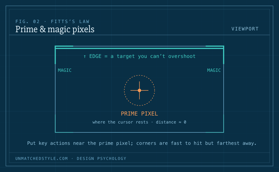
The prime pixel is wherever the cursor already sits at the start of an interaction, the cheapest possible place to reach, because the distance is zero. It’s usually somewhere near the center of the screen or wherever the last action happened. High-value controls want to live near it.
The magic pixels are the four corners and the four edges of the screen. On a desktop, these behave as if they were infinitely large in one or more dimensions: you can throw the cursor at an edge as fast as you like and it physically cannot overshoot, the screen boundary stops it dead. A one-pixel-tall strip at the very top of the display is, for targeting purposes, an enormous target, because you don’t have to slow down to hit it. This is why the menu bar pinned to the top edge of a Mac is so fast, why “hot corners” work, and why a toolbar whose icons bleed all the way into the screen edge beats one with a tidy non-clickable margin between the tools and the edge.
The flip side matters just as much: because corners are the farthest points from the prime pixel and awkward to reach deliberately, they’re the worst place to put something you want people to find. That tension, infinitely large but maximally distant, is exactly why corners are reserved for either power-user shortcuts or things you’re fine with people ignoring.
On phones, the law bends to the thumb
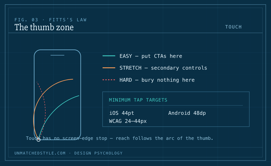
Everything above assumes a cursor and a screen edge that pins it. Touch rewrites the rules. A thumb has no acceleration curve and no hard stop at the screen’s edge, and the “infinite edge” trick weakens because screen chrome, notches, and the unpredictable way people hold their phones get in the way. Test edge and corner gestures on real devices before you rely on them.
What replaces the magic-pixel logic on mobile is the thumb zone, the arc a thumb can comfortably sweep while holding the phone one-handed. The easy-to-reach territory is the lower and center portion of the screen; the top corners are a stretch. So the mobile version of Fitts’s Law says: keep primary actions large and inside that comfortable arc, not stranded in a top corner. This dovetails with the platform minimums for target size that exist precisely because of Fitts’s work, roughly 44×44 points on iOS, about 48dp on Android, with accessibility guidance (WCAG) treating 24px as a floor and 44px as the comfortable target. Those numbers aren’t arbitrary; they’re the sizes at which error rates settle down.
And mind the spacing. Targets that are big but crammed together reintroduce errors, because now people overshoot from one into another. “Save” and “Cancel” should be close enough to compare at a glance but far enough apart that nobody deletes their work reaching for save.
The same law, pointed the wrong way
Because Fitts’s Law reliably predicts what people will click, it can be used to engineer clicks that aren’t in the user’s interest. This is worth naming plainly, because the mechanics are identical, only the intent flips.
Consider a purchase screen that hands a giant, brightly styled block to “Subscribe & Save” and tucks the one-time purchase behind a tiny radio button. Nothing there is technically hidden. But the subscription target is enormous and the one-time option is a small, precise thing you have to aim for, so a predictable share of people end up starting a subscription they didn’t set out to buy. The geometry made the decision before the copy ever got read.
Or consider the cancellation flow that inverts everything the rest of the product does: the account-management or unsubscribe link in an auto-renewal email is rendered as tiny, low-contrast, easily-missed text, while whatever keeps you subscribed is large and obvious. Making the exit small and distant is Fitts’s Law deployed as friction, a dark pattern, and increasingly a regulated one.
The tell for ethical use is simple. Are you making the action the user came to take easier, or are you making the action you profit from easier at the user’s expense? Same law. Opposite ethics. Placing an unrelated ad or a surprise upsell right at the prime pixel, where a click is nearly free, is the small everyday version of the same misuse.
A short working checklist
When you’re reviewing a screen, walk it in this order:
- Name the one primary action. If you can’t, the screen has a priority problem no sizing will fix.
- Make that target the biggest, easiest thing to reach, full clickable area, generous hit region, close to where attention already is.
- Demote the rest. Secondary actions get smaller and quieter; the geometry should agree with the hierarchy.
- Find the prime pixel, where does the pointer or thumb start? and pull important things toward it.
- Use edges and corners deliberately. Pin frequent global actions to an edge on desktop; keep the corners for shortcuts or things that can be missed.
- On mobile, respect the thumb zone and the platform’s minimum target sizes, and give adjacent targets breathing room.
- Run the honesty check. Whose task are you speeding up, theirs or yours?
Fitts’s Law isn’t a style trend that will age out, and it won’t fix motivation, unclear copy, or a confusing information architecture on its own. It’s more like gravity: a constant, quiet force acting on every interaction whether you account for it or not. Design with it and your interface feels effortless in a way people can’t quite articulate. Design against it and they’ll feel the drag on every click, even if they never learn its name.


0 Comments