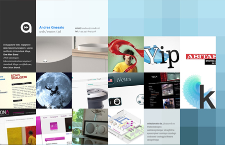
Submitted by Andrea Gnesato, @freewally0071. Designer & Developer.
My 3rd portfolio redesign. this time going more minimal and a little experimental.
I really like the experimental feel to the layout. Featuring the color blocks on top of the grid is a nice move to keep the design visually interesting. I think this layout is really working at it’s best on a portfolio detail page.


0 Comments