yourneighbours.de

yourneighboursde

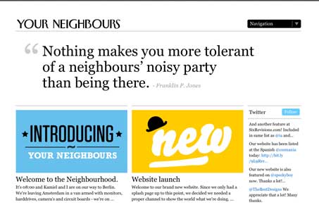
Really great looking typography balanced well with some nice imagery for each post. The big drop down selector/navigation that turns into a mega-dropdown type thing is also pretty well done. Once critique would be that I have no idea what the site is for, I’m assuming this is a web design shop or cooperative of some sort. I think it would be hugely helpful to have just a little intro or elevator pitch right up front somewhere easy to find. I see there’s an ‘about us’ page but that may be asking an awful lot for people to find that easily. Other than this, i think it looks and works quite well visually and worthy of study as a good design.


yourneighboursde

Really great looking typography balanced well with some nice imagery for each post. The big drop down selector/navigation that turns into a mega-dropdown type thing is also pretty well done. Once critique would be that I have no idea what the site is for, I’m assuming this is a web design shop or cooperative of some sort. I think it would be hugely helpful to have just a little intro or elevator pitch right up front somewhere easy to find. I see there’s an ‘about us’ page but that may be asking an awful lot for people to find that easily. Other than this, i think it looks and works quite well visually and worthy of study as a good design.

Kinsta

1 Comment

  1. Edial Dekker

    Thanks for your feedback, we’ll definitly take that into account when we’ll tweak the website anytime soon.

    Reply

Submit a Comment

Your email address will not be published. Required fields are marked *

Time limit exceeded. Please complete the captcha once again.

News & Articles

Fitts’s Law: Why the Easy Button Wins

Fitts’s Law: Why the Easy Button Wins

Large, close targets are faster to hit than small, distant ones, that’s Fitts’s Law. A look at the 1954 rule behind buttons, prime and magic pixels, thumb zones, and dark patterns.

The Call to Action, Revisited

The Call to Action, Revisited

The Call to Action hasn’t changed in a decade, but the bar has. A fresh look at prominence, copy, mobile tap targets, and accessibility, with lessons from three major design systems.
