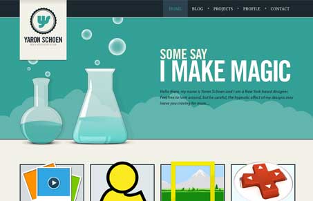
This is absolutely a beautiful design. It’s got everything I love in a website, illustrations, fine detail, the highest level of craftsmanship. Listen to our screen-cast review of the site for more details. The short list of my favorite parts of this site are the portfolio detail pages and the blog post pages, they provide for lots of different viewing experiences as you make your way through them. Marvelous website here.
Glassmorphism: The Transparent Design Trend That Refuses to Fade
Glassmorphism brings transparency, depth, and light back into modern UI. Learn how this “frosted glass” design trend enhances hierarchy, focus, and atmosphere, plus how to implement it in CSS responsibly.


Agreed, excellent hierarchy and nice color palette in the header, as well as a sweet logo.
I find the contrast between the illustration style in the header and the style in the content regions below it somewhat jarring. I believe the design would feel more unified if he applied the same shiny treatments to the AIM logo, etc. Would also be nice to see those illustrations use colors of the same saturation level as those in the header, as a way to bridge the gap between his brands and theirs.
Another nit picky thing is that I think he meant “definitely” but instead used “defiantly” in the tabbed section at the bottom of the page 🙂