Xavier Roggen

http://xroggen.com/

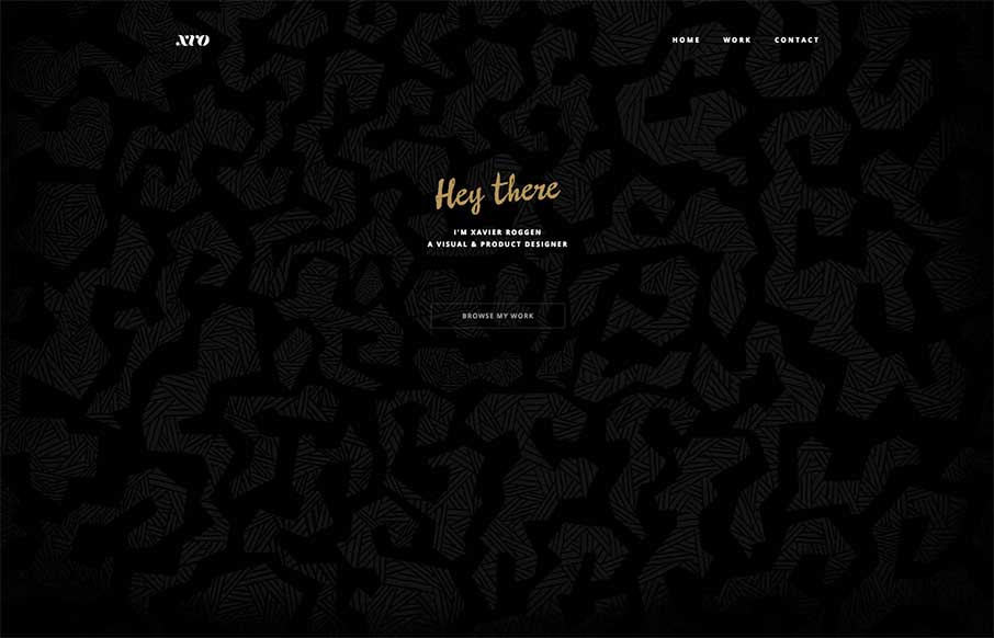
Xavier Roggen’s portfolio site out of Brussels is minimal, but there are some cool takeaways from it (we try to get those in each site we look at). I like the full width image slider background and the filtered images he uses. Sometimes style is a matter of content and how it’s portrayed. Also like the Work detail pages because they all have a little sercy in the footer (like the one below).

xroggen-footer


0 Comments

Submit a Comment

Your email address will not be published. Required fields are marked *

News & Articles

Sign-Up: Enhancing Conversions through good UX

Sign-Up: Enhancing Conversions through good UX

Optimize your website’s sign-up process by focusing on clarity, ease, and user mindset. Clearly explain the purpose, benefits, and steps, and use social proof to build trust and drive conversions.

The Essential Guide to Getting Started on Freelance Writing

The Essential Guide to Getting Started on Freelance Writing

Explore the lucrative and fulfilling world of freelance writing with our essential guide. Learn about specialties like blogging, social media, article, and technical writing. Build a portfolio, find work, set up your business, and discover the potential earnings. Embrace the freedom of working from home and follow tips for success in your dream career.