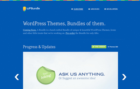
Nice simple layout with some good flourishes tucked here and there. I love that robot illustration, if that doesn’t get you to check out their twitter stream not much will. I like the heavy dark background that starts off the top part of this site and then you get hit with the lighter background design as you get down the page.
Glassmorphism: The Transparent Design Trend That Refuses to Fade
Glassmorphism brings transparency, depth, and light back into modern UI. Learn how this “frosted glass” design trend enhances hierarchy, focus, and atmosphere, plus how to implement it in CSS responsibly.


I love the color palette of this site. Everything is very minimalistic (which I love) and the contrasting colors just work. The one aspect that I felt was lacking was a navigation of sorts. I don’t mind scrolling, but a JQuery smooth scroll to anchors would have been lovely to showcase the rest of the content and site.