
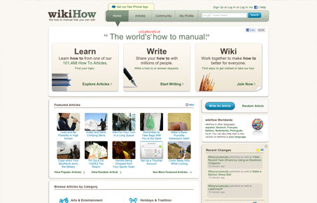
Nice modular design to wikihow.com. I like the main nave design, not connected to the other content elements but the arrow pointing down from the link/page you’re on is a good indicator to inform you where you are. I also like the way the “free iphone app” link is displayed. The design is clean and really gets out of your way as you utilize the content. I also can’t get over how fast this site seems to perform.




Hey! Thanks for the awesome feedback! I’m glad you like the design and are impressed with the site speed. 🙂