
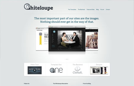
Whiteloupe.com provides a very clean, almost Apple-like, experience that exudes sophistication and maturity. Application of battle-tested design patterns give the site a solidity that feels stable and open, with a strong use of white space and understated typography.




0 Comments