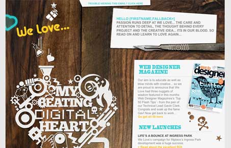
This is a really heavy illustrative email newsletter design. I like the big heart graphic and the main body text on the right like that. The wood background is a little out of place but it’s probably more interesting in the end than just a flat color.
You can check out the original full layout here.


0 Comments