webmaker.org

webmaker.org

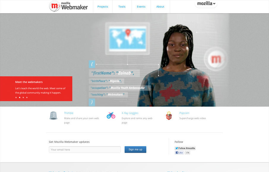
Nice clean and straight forward design for the Mozilla Webmaker website. Some interesting responsive navigation changes too. Wonder why they chose to drop that big selection nav off the Mozilla logo on smaller screen sizes. Overall I like the minimal feel to it while keeping it content rich as you scan/scroll down the page.


Nice clean and straight forward design for the Mozilla Webmaker website. Some interesting responsive navigation changes too. Wonder why they chose to drop that big selection nav off the Mozilla logo on smaller screen sizes. Overall I like the minimal feel to it while keeping it content rich as you scan/scroll down the page.

Kinsta

0 Comments

Submit a Comment

Your email address will not be published. Required fields are marked *

Time limit exceeded. Please complete the captcha once again.

News & Articles

The Call to Action, Revisited

The Call to Action, Revisited

The Call to Action hasn’t changed in a decade, but the bar has. A fresh look at prominence, copy, mobile tap targets, and accessibility, with lessons from three major design systems.

Brutalism: The Beauty of Breaking the Rules

Brutalism: The Beauty of Breaking the Rules

Brutalism in web design rejects perfection for authenticity. Stark grids, raw type, and honest structure create interfaces that feel human, intentional, and impossible to ignore. Break the rules, on purpose.

