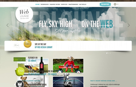
This is a site full of vibrance. There’s a mix of a lot of animation, 3D treatment, and rich colors and textures that could seem overwhelming, but I actually enjoy it. The home page is still easy to scan despite what might seem like visual clutter. The overall look is warm and tactile. The logo badge on its own appears to be a bit stark and bland, but in contrast to the rest of the page, it works. Small touches in the thumbnail images that extend outside of the box add interest, and I like that each page feels like it has its own intentional experience.


The Call to Action, Revisited
The Call to Action hasn’t changed in a decade, but the bar has. A fresh look at prominence, copy, mobile tap targets, and accessibility, with lessons from three major design systems.


Waw thanks guys for featuring us and for the nice comments.
Man, this site is beautiful. I think its great that every page is strongly customized and the presentation of the gallery is striking.