
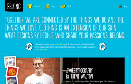
I’m a sucker for the hand-drawn and illustrated look, but it’s got to be relevant. On this site, that’s exactly what you get – and it’s well done too. Excellent font pairing, nice little offset iconography and overall well “tailored” page. (Yes, I love a good pun too.) I like how they’ve handled the choosing of your shirt. It’s creative and doesn’t get in the way. Fun concept and site.


Fitts’s Law: Why the Easy Button Wins
Large, close targets are faster to hit than small, distant ones, that’s Fitts’s Law. A look at the 1954 rule behind buttons, prime and magic pixels, thumb zones, and dark patterns.


0 Comments