
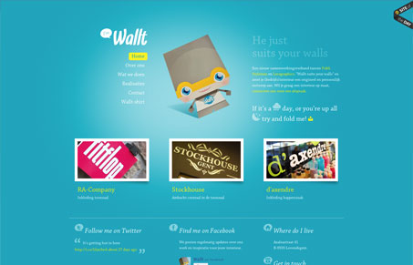
Fun little branded character to carry this website. Looks like they’ve done some fun things off the web to pull it back into their site -neat. I think the white text on blue background gets tiresome to read after a while but overall the simplicity and straight up layout of the thing make it work.




0 Comments