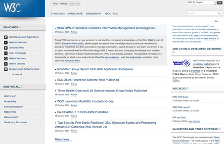
This is the newly redesigned w3c.org website (not too new, but newish). I really like this design in many ways, at the same time it’s just too dang full of info. I know that’s hard NOT to do, it’s the wc3 after all. I love the grid, and the way the info is presented in a logical manner. I also think the different style sheet selection across the top is pretty cool too. I think in many ways they stretched with a lot of the interactions, I think more simplicity would go a long way on a site like this. The information still feels pretty spread out and people who are new to the wc3 look like they still might get a bit lost in the content. Over all though, this is a great face lift to a really huge site that’s been needed for a long long time.
Glassmorphism: The Transparent Design Trend That Refuses to Fade
Glassmorphism brings transparency, depth, and light back into modern UI. Learn how this “frosted glass” design trend enhances hierarchy, focus, and atmosphere, plus how to implement it in CSS responsibly.


0 Comments