vyniknite.sk

vyniknitesk

Submitted by Elemental media @elementalmedia.

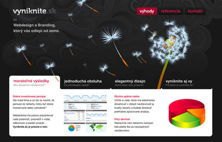
Nice subtle background graphic here. I was pleasantly surprised with how simple this site is, only three main navigation buttons at the top. Then there’s a nice area on the homepage that seems to answer questions about what they do which is a nice way of keeping their clients in mind as an audience for the site. The gallery is also really simple, providing just some explanation and close-up, detail shots without the flashy screen takeover.


vyniknitesk

Submitted by Elemental media @elementalmedia.

Nice subtle background graphic here. I was pleasantly surprised with how simple this site is, only three main navigation buttons at the top. Then there’s a nice area on the homepage that seems to answer questions about what they do which is a nice way of keeping their clients in mind as an audience for the site. The gallery is also really simple, providing just some explanation and close-up, detail shots without the flashy screen takeover.

Kinsta

1 Comment

  1. Tomas Mikletic

    Thank you Julia for your praise. Our team was very encouraged by it.

    Reply

Submit a Comment

Your email address will not be published. Required fields are marked *

Time limit exceeded. Please complete the captcha once again.

News & Articles

The Call to Action, Revisited

The Call to Action, Revisited

The Call to Action hasn’t changed in a decade, but the bar has. A fresh look at prominence, copy, mobile tap targets, and accessibility, with lessons from three major design systems.
