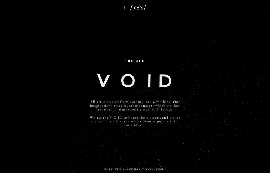
I didn’t even attempt to see what was under the hood on this site – didn’t care – was having too much fun with it. Void was done by Hi-Res out of London. Not sure why they did it – but who cares – pretty darn awesome – happy Friday!
Glassmorphism: The Transparent Design Trend That Refuses to Fade
Glassmorphism brings transparency, depth, and light back into modern UI. Learn how this “frosted glass” design trend enhances hierarchy, focus, and atmosphere, plus how to implement it in CSS responsibly.


0 Comments