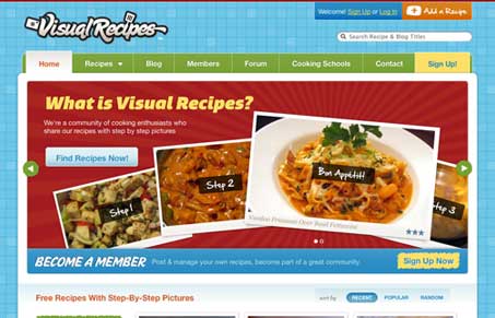
There is a lot of great stuff happening in this design. The navigation is clear and concise, that’s a product of good IA in my opinion. The mega-dropdown element is really nice too, because it cuts through the clutter of what could be a big navigation menu to deal with and let’s the user access what they want. And hey Jakob Nielson says they work well…
The colors are lively, like a kitchen should be, right? There is also a lot of great visual organization on the home page, the rhythm in the way the big image is followed by that yellow box to the blog down to the footer is really nice in my opinion. There is also a good mixture of little illustrations and type.
Jonathan over at Fortyseven Media(the company that produced this website) has written a great post on the design of this website. He takes us from logo concept to wireframing to the final product. The process looks like it took them a lot of work to get through but the end product is great!


0 Comments