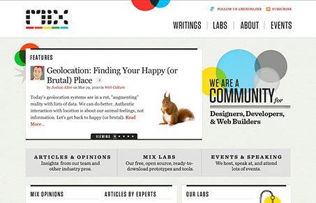
I like the stark black and white design mixed in with the splashes of color. The typography is nicely done too. It’s really pretty clear what this site is all about on a quick glance that’s not necessarily easy to pull off with something new(ish) like this. Really good work.
Glassmorphism: The Transparent Design Trend That Refuses to Fade
Glassmorphism brings transparency, depth, and light back into modern UI. Learn how this “frosted glass” design trend enhances hierarchy, focus, and atmosphere, plus how to implement it in CSS responsibly.


0 Comments