
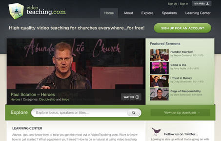
Really slick well done looking website. I love several elements of this site, the ‘explore’ search box with the way the submit button is done looks really cool and unique. I think the ‘explore’ section is really well organized visually, the boxes are a good way to visually separate links. There are some really great details on the screens where the video is playing, the like this and share buttons are well done to say the least, I really like how that functionality was handled. I don’t like how I click ‘sign up’ and am immediately greeted with a license to agree too, I understand why I may be there, but it’s very unfriendly. Good site to review, lots of good details throughout, give it the once over and i’m sure you’ll find some great design ideas here.


Fitts’s Law: Why the Easy Button Wins
Large, close targets are faster to hit than small, distant ones, that’s Fitts’s Law. A look at the 1954 rule behind buttons, prime and magic pixels, thumb zones, and dark patterns.


0 Comments