
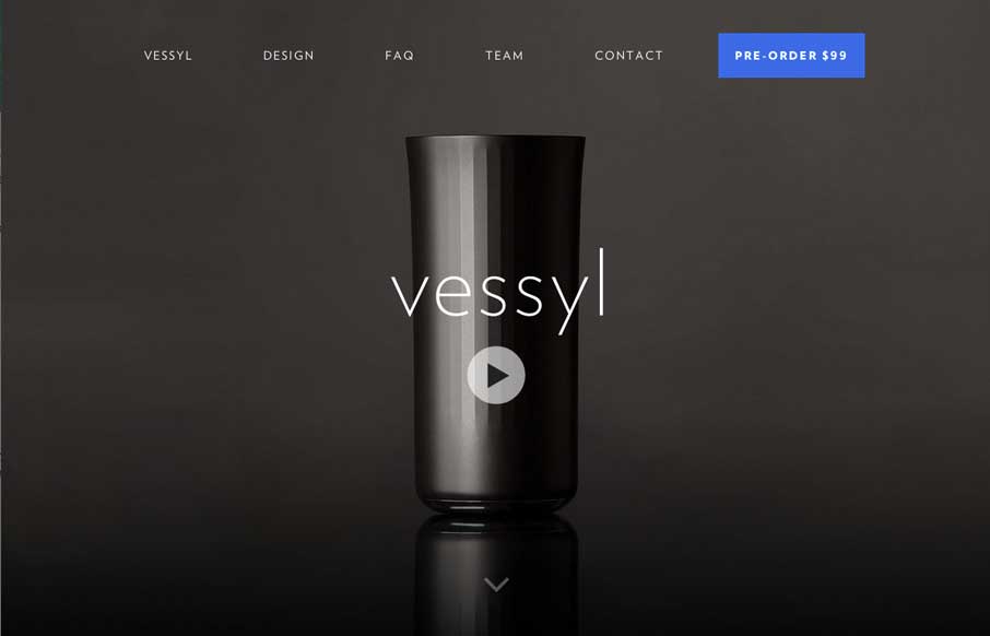
We’re kind of fitness and gadget junkies here at UMS. So when the site was submitted, it was cool to imagine what the possibilities were for Vessyl as a device and company. Design-wise, the site itself is slick and sharp, which seems to be very much in-line with the design of the Vessyl cup itself. They have just enough parallax and animation to give good life to an HD site experience. Also, the contact page – it’s simple and direct. I like getting away from contact forms, and directing users of the site where to interact with you on the interwebs. Um.. and if you guys need beta testers, we’re available… just sayin’…


Fitts’s Law: Why the Easy Button Wins
Large, close targets are faster to hit than small, distant ones, that’s Fitts’s Law. A look at the 1954 rule behind buttons, prime and magic pixels, thumb zones, and dark patterns.


0 Comments