I saw the new veerle.duoh.com design was up because of @jasongraphix‘s tweet:
Sad to see @vpieters‘ landmark 2.0 design go, but her new design is equally impressive. http://veerle.duoh.com/
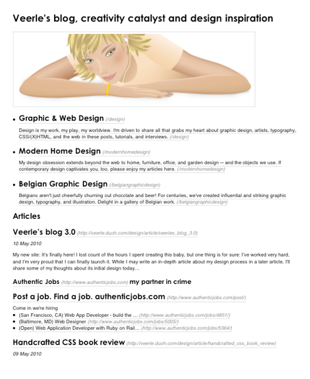
Veerle Pieters’ new version of her blog is now live. It’s pretty much a total rework of the old site (which you can still see here: http://veerle-v2.duoh.com/. ) I know I’ve been waiting to see what she would do with a redesign and as expected i’m not let down in the least.
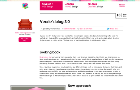
Veerle has a great post about what made her decide to rework the site and some of those design decisions she’s made:
When I launched my previous site, I was trying out different things, such as interviewing designers, illustrators, and other artists. Later on, I also began writing about modern home design from time to time. But, as with other sites (and many aspects of life), you grow and experiment, and before you know it, you need to restructure in order to have balance, clarity, and an experience that makes sense. I was bothered by the way you had to navigate through the old site to get to the content you wanted, and I sensed that a lot of good content was sort of hidden and hard to find.
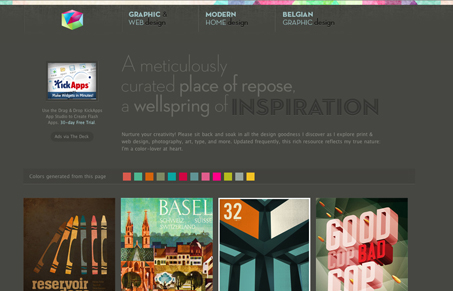
It’ll go without saying that I love it, it’s top-notch. I love the colors, the way it starts off light and bright and moves you into a darker feeling with the olive & earthly colors. The footer is also really well done both visually and organizationally in regards to the content.
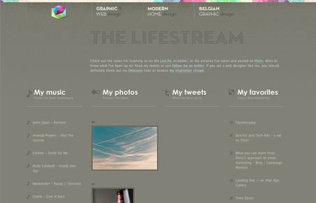
I LOVE the lifestream page.
The “lifestream” is something that I would love to see more on people’s websites.
She has created a “high contrast” version of the post pages in case you need that, that’s just thorough design and top rate in my book.
Something I don’t do often is print web pages but every so often i’ll check out a website to see if they’ve paid attention to that aspect of the HTML/CSS. I wasn’t too surprised to see that Veerle had setup a pretty decent set of print styles to see the new website through.

This design also has some awesome content, it always has and I love the multi column display in the Inspiration & Belgium design feed pages. The changeover to this inner grid as you view these sections is subtle yet very much inspiring as I look at it for the first time.
All in all, I’d say this is a highly successful redesign of Veerle’s site we’re looking at. I’d encourage everyone to go pick around on it and enjoy it.


Veerle is one of my favorite graphic design geniuses. She has a unique way to meltdown Swiss typography mood with web 2.5 (yep, no more 2.0) styles.
But, as you guys already said in the beginning, her style is unmatched.. and need not to see that happens too. Thanks for posting this.