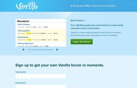
Really very simple page for this software website. I like the non complexity of the design and limited color palette. It really works well with the name “vanilla”. What I like most isn’t shown in the above screenshot but the ‘8 Reasons Why You’ll Love Vanilla’ grid design is wonderful. It’s engaging on it’s own and leaves me wondering why the entire site doesn’t play this particular design portion up more.
Glassmorphism: The Transparent Design Trend That Refuses to Fade
Glassmorphism brings transparency, depth, and light back into modern UI. Learn how this “frosted glass” design trend enhances hierarchy, focus, and atmosphere, plus how to implement it in CSS responsibly.


0 Comments