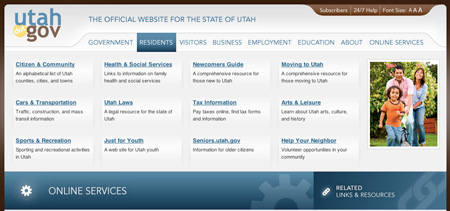
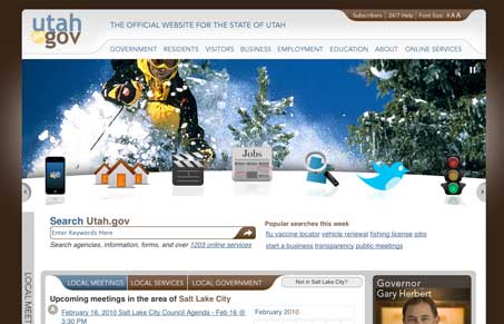
What a great state gov website design. It’s got a large chunk of flash in the home page but it’s not too obtrusive and winds up being quite helpful navigation wise. Overall it’s loaded with content on the homepage like sites like this normally are but it’s very well organized and content is compartmentalized like it should be.

The main navigation slides out to become a mega-dropdown of sorts, I think it could really be overwhelming but also quite useful since it’s the website’s content that’s overwhelming after all.


0 Comments