
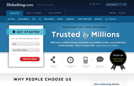
I love the typography on this website design, it’s very clean and crisp. The colors are very nicely chosen as well. With the dark blue and lighter blue and other design elements really working together to help display a nice top-notch looking website. Trust is an important thing to convey with your design and this one really seems to do that for me. The illustration and icons really seal the deal there too, since they are really crisp looking. Nice work here!




I agree, the typography is top notch, but it was the layout that really stood out for me. They kept a huge amount of information organized, readable, and visually interesting. The topic of unlocking phones can easily border on uninteresting / boring to the non technical person, yet unlocking.com did a great job of using color, typography and layout to create an visually engaging site that made the business of unlocking phones, sexy and fun.