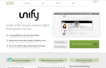
I think this is a really good site design, it looks pretty good, has a nice clean grid and some tight little detail work – like with the modal window on the main video. While I don’t necessarily like the type pairings, particularly how they go with the logo type, it works. What I do like is the copy, it’s engaging and explains clearly and concisely what the product is and does. That’s my favorite section honestly, there’s not only hierarchy in the typography there but there’s hierarchy in content itself, that’s not easy.
Glassmorphism: The Transparent Design Trend That Refuses to Fade
Glassmorphism brings transparency, depth, and light back into modern UI. Learn how this “frosted glass” design trend enhances hierarchy, focus, and atmosphere, plus how to implement it in CSS responsibly.


0 Comments