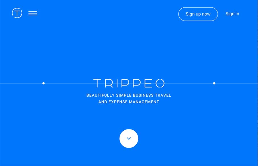
We reviewed the Trippeo site last year, pre-launch, and remembered it was pretty cool. So we’re looking at it again today – even better.
The SVG animation that’s integrated with the video backgrounds and content areas give you a good idea of what the app is about – helps sell the idea (which is the point right?). And for those of you that might call “scroll-jacking” – we’ve been seeing more appropriate uses of it trending – like Trippeo uses. The user experience on websites should not only be fluid, but these experiences should be meaningful to the site’s purpose. Having a mixed interval approach to content – look and feel (video background) + information (content blocks) – makes business sense because you take your potential customer through the sales funnel properly. And if you can integrate it with a story (the animated svg circle with the expenses), then you’re essentially making an active PowerPoint to build your case for someone to buy your stuff.
That is the power of design + business strategy.


0 Comments