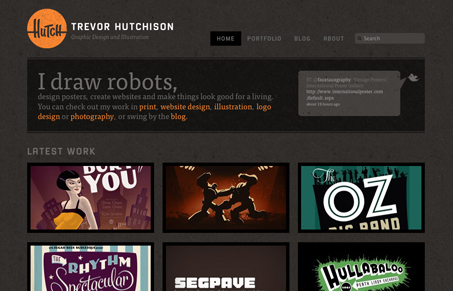
I love these colors, these dark browns and orange are really great together. Plus robots are cool and this guy draws some awesome Transformers. The design looks like an altered template from one of these guy’s templates. But, that’s fine by me, in this instance together this is a pretty nice looking theme and website content.
Glassmorphism: The Transparent Design Trend That Refuses to Fade
Glassmorphism brings transparency, depth, and light back into modern UI. Learn how this “frosted glass” design trend enhances hierarchy, focus, and atmosphere, plus how to implement it in CSS responsibly.


0 Comments