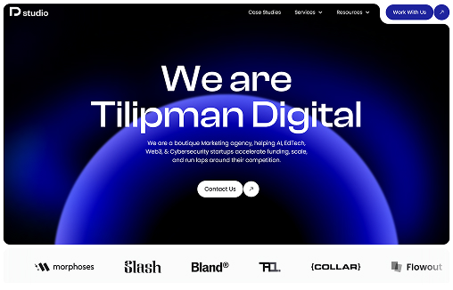
The design of Tilipman Digital’s website is clean, sharp, and conversion-focused — embodying a modern B2B aesthetic with a clear emphasis on clarity, credibility, and action.
The layout uses generous white space, concise typography, and a structured visual hierarchy that naturally guides the visitor’s eye through key sections without distraction. Subtle animations and scroll interactions add sophistication without overwhelming the content.
The color palette is professional and muted, using shades of black, gray, and white with restrained accent colors — creating a polished, trustworthy feel that fits the agency’s growth-driven positioning.
Each section is designed with purpose:
Above the fold features a clear, outcome-driven value proposition.
Service sections are modular and easy to scan, using clear headlines and strong CTAs.
Case study highlights showcase credibility and proof, presented with clean visuals and minimalistic layouts.
Footer and navigation are simple, unobtrusive, and optimized for easy exploration.
Overall, the design strikes a balance between professional minimalism and quiet confidence, positioning Tilipman Digital as a serious partner for B2B brands looking to scale through better websites.


0 Comments