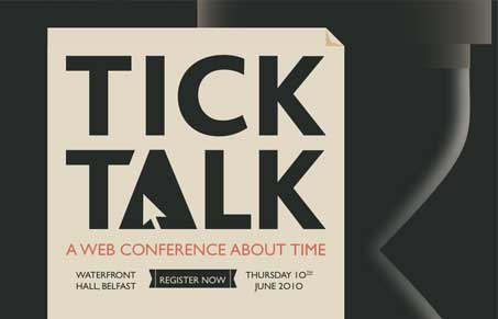
Pretty cool project! Turns out it’s not a real conference, too bad I would love to go check this out. It’s an interesting design in that it’s not afraid of scrolling (who should be) and it’s bold graphic style really sings loudly to me. I like how it engages you as you visually scroll down the site/page. The interactions are nicely done as well.
Glassmorphism: The Transparent Design Trend That Refuses to Fade
Glassmorphism brings transparency, depth, and light back into modern UI. Learn how this “frosted glass” design trend enhances hierarchy, focus, and atmosphere, plus how to implement it in CSS responsibly.


0 Comments