
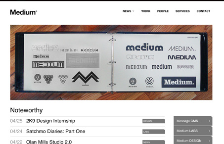
Really nice website for this web design company. I like the logo in the top right Left that changes as you refresh the homepage. Nice portfolio section too. I’d love to see some explanation along with the services items on the services page.


Fitts’s Law: Why the Easy Button Wins
Large, close targets are faster to hit than small, distant ones, that’s Fitts’s Law. A look at the 1954 rule behind buttons, prime and magic pixels, thumb zones, and dark patterns.


Thanks for the mention and the feedback. Version 2.0 is in the queue, with a re-worked nav, expanded “Labs” section and some UI fixes.
love the page and the people behind it!
*don’t you mean the logo on the top left? I just remember Josiah commenting about how much he hates sites for the bad design with logos on the top right so I did a double-take.
You are correct! Top left indeed.