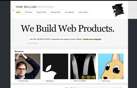
I like the simple straight forward layout, laced with the dotted lines and other symbols. It’s clean and doesn’t detract from the imagery. Very nice.
Glassmorphism: The Transparent Design Trend That Refuses to Fade
Glassmorphism brings transparency, depth, and light back into modern UI. Learn how this “frosted glass” design trend enhances hierarchy, focus, and atmosphere, plus how to implement it in CSS responsibly.


0 Comments