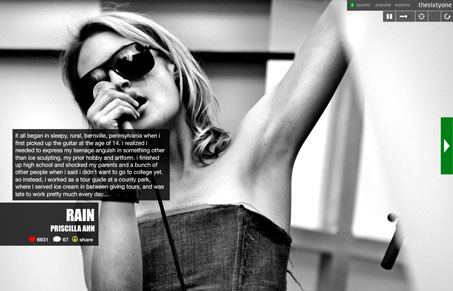
The Sixty One is a very interesting design case. They’ve taken this site from your standard fare website design to something that’s wholly different and engaging. Both Jay and Julia here at UMS had noticed this site very early on, being music aficionados they gravitated to The Sixy One’s social music “game” playing functionality. They both were quite surprised with the new design and we’ll be eventually posting a podcast or something on this site for sure because it’s so interesting.
What’s interesting about it is that it’s very linear, you start out with the first artist that loads, randomly, then you can go to the next and the next or begin to explore other navigational elements on the site. Being presented with a large image while music is playing is a much different experience than i’m used to. You being to reference the two together quite naturally. My critique wouldn’t be honest if I didn’t note that I’m not entirely sold on it from a usability standpoint. Most of the icons that you’re presented with aren’t clear to what their actions are and generally I feel that hiding navigational elements from the user can be bad.
The experience of this website is something you really need to go and check out for yourself. It’s a completely different way to discover new music and that no matter what else anyone else can complain about, in my opinion, is what makes this website so very great.


I like the61’s new design with one caveat… when I was done playing the “game” I used to like to search for music on the site- searching for what you want to listen to now seems to be difficult or impossible