
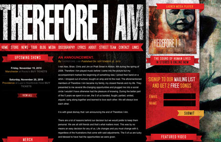
Really nice grungy treatment to this website. I like the large display type in the header area, and the nice texture/grunge there. There might be one too many banner type elements on the design, but they are each well done. I can’t decide if it’s too matchy-matchy or not. In the end, I just like the way it looks and it looks cool, sometimes that’s enough.




The textures on this site are really nice, and I’m not bothered by the “matchy-matchy”-ness of it all. (Is that a new term?)
However, since this site is mainly a blog, I would like to see more attention paid to styling of the blog posts. It’s functional and nice as is, it’s just that so much work was put into the top part of the site, it’s a bit of a shame to scroll down and have it become very run-of-the-mill.
Totally agree with you Jay, as you scroll down the page it does get really standard blog looking.
And yes, “matchy-matchy” is a new(ish) term. I happen to like it. 🙂