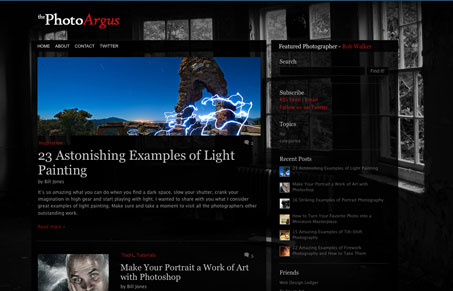
I like the background image in this design, how it’s used to frame the grid in like that, with it being a picture of a room full of windows. It really adds to the visual organization of the page layout. I also like the footer and how it uses more background imagery (the camera) to close out the site.
Glassmorphism: The Transparent Design Trend That Refuses to Fade
Glassmorphism brings transparency, depth, and light back into modern UI. Learn how this “frosted glass” design trend enhances hierarchy, focus, and atmosphere, plus how to implement it in CSS responsibly.


0 Comments