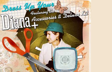
This Lomography International email newsletter design is pretty cool with that giant image using those “Diana” Camera from the 60’s pictures. As you scroll down you see the cutout shapes that link you directly to the products themselves, then showing off the pics it can take. All in an extremely visually interesting and clever way. Maybe i’m just jealous that I don’t have one but I love this email design.
Glassmorphism: The Transparent Design Trend That Refuses to Fade
Glassmorphism brings transparency, depth, and light back into modern UI. Learn how this “frosted glass” design trend enhances hierarchy, focus, and atmosphere, plus how to implement it in CSS responsibly.


0 Comments