
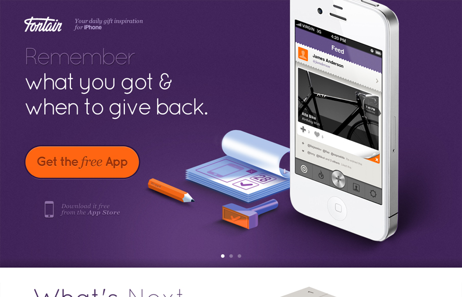
I love how all the items/things used on the page are rendered, even the iPhone. It creates a very unique vibe. I love the colors and the dark first half and light second half, it creates a nice dichotomy for the site design. I also dig the way the slideshow is used, it introduces and almost animated aspect instead of just showing more product shot. Very smart site.


Fitts’s Law: Why the Easy Button Wins
Large, close targets are faster to hit than small, distant ones, that’s Fitts’s Law. A look at the 1954 rule behind buttons, prime and magic pixels, thumb zones, and dark patterns.


0 Comments