Submitted by: Aaron Payne @creativepayne
Role: Designer & Developer
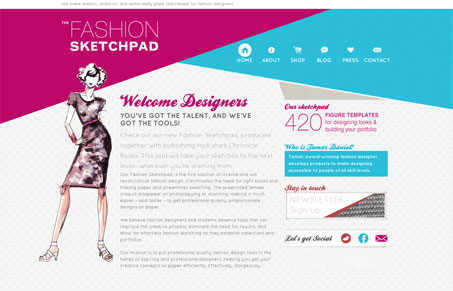
I think this site is really unique in a few ways. First I think it’s great that it’s taking some cues from the fashion world with edgy, overlapping diagonal lines, bright colors and patterns. The illustrations on each page are really great and perfect for the product. It’s kind of neat that they put their intro sentence(?) right there at the top of the page. Although it’s small, I definitely read it first and well, instantly wanted a fashion sketch pad too.
With all that said, these guys definitely still need to address some content issues. The copy in general is set too small and at such a low contrast grey that it’s hard to read against the patterned background. This site could be a lot stronger if the content matched the boldness of the art.


0 Comments