thecombine.org

thecombineorg

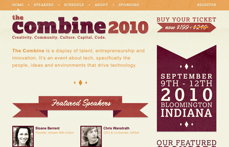
I really like the strong graphic boldness to this website design. The strong lines and blocky elements give it a nice grounded feel. There’s also some nice subtle textures in the main shapes to keep the layout from getting boring looking. I do wish there was a bit of interactivity to the elements on the page, like link mouse overs and such. Of course that stuff isn’t needed to be usable, I just feel like with such a stark website design some interactive elements would soften it up a bit.

Kinsta

0 Comments

Submit a Comment

Your email address will not be published. Required fields are marked *

Time limit exceeded. Please complete the captcha once again.

News & Articles

Brutalism: The Beauty of Breaking the Rules

Brutalism: The Beauty of Breaking the Rules

Brutalism in web design rejects perfection for authenticity. Stark grids, raw type, and honest structure create interfaces that feel human, intentional, and impossible to ignore. Break the rules, on purpose.

Monochrome Minimalism

Monochrome Minimalism

Monochrome Minimalism merges Bauhaus discipline with IKEA simplicity. Clean grids, muted tones, and functional beauty create digital calm, proof that restraint, not decoration, defines timeless design.