
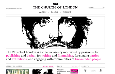
The Church of London has a lot of great work to show off. Truly inspired and interesting work. Their site is chock full of content, and the minimal black plus hints of pink really works well. The only quibble I have is the choice of the thin sans-serif for the titles. It’s just too wispy and thin for a site that has a newspaper-like feel. Something bolder, or not quite as modern would be a better choice in my opinion. Otherwise it’s great site.




Very stripped down site with a slightly newspaper layout feel. Pretty sweet in general. I don’t know why but it feels distinctly European to me.
I’d say that this site has a lot going for it. On first landing, its definitely visually impacting. Simple but effective typography really support the visual style and the design allows the content (lots of images and lists) to provide texture and variety.
The only things I’d like to see is a little more attention paid to visual hierarchy. Because everything is so minimal, nothing really has prominence and the site in general tends to be a washed out, difficult to scan grey. The subpages, which are much more specific in their content, seem to suffer considerably less from this problem.
Otherwise, its a great site.
Totally, once you get past the big image and the text under it there’s very little hierarchy between all the things on the page, other than the amount of stuff in each section.